Create and Edit Columns
Learn how to work with columns when building reflowable HTML5 publications, including how to add, edit, move, and manage column layouts.
What is the Mobile-First template?
The Mobile-First template helps you export content from a PDF into a responsive web publication. It supports layout blocks and styling options such as parallax, images, audio, resizable columns, video, and more.
The basics of columns
Publications are built from four major components: pages, blocks, columns, and elements. Pages contain blocks, blocks contain columns, and columns contain content such as text, images, and videos.
Add a column
There are two ways to add a column. First, add a block to the page by dragging and dropping a block template from the left-side menu. You can choose from multiple column layout options, and you can change them later.
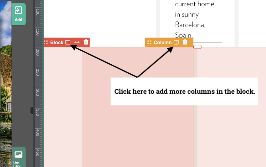
The second method is to select a column in the block where you want to expand the layout, then click the Add Column icon at the top of that column. The new column appears to the right of the last column in the block.
When you add a new column, the block automatically recalculates columns to equal sizes.
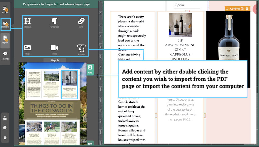
Add content to a column
Before adding content, select the target column. You will know it is selected when the orange column tab is active. Then double-click the element you want to import into that column.
You can also add content from your computer using the Elements icon in the left-side menu, then following the upload prompt.
Change column size
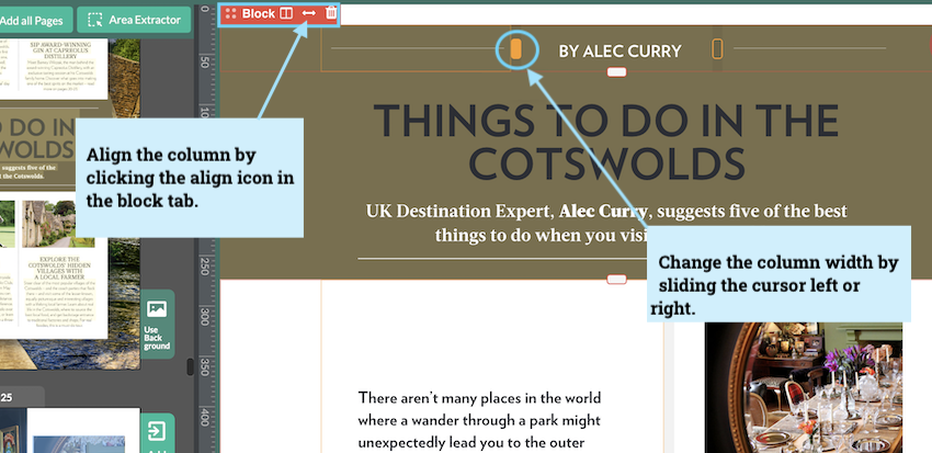
Resize columns by dragging the divider between columns to make each one larger or smaller.
If you want to reset all columns in a block to equal widths, select the red block tab and use the equalize arrow control.
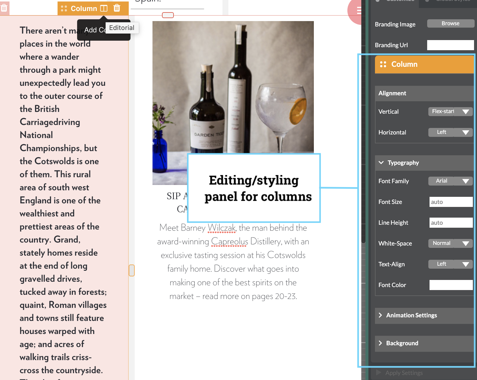
Edit a column
After adding content, you can edit each column independently. You can adjust size, padding, and content alignment. Column styling controls are available in the right-side panel when the column is selected.
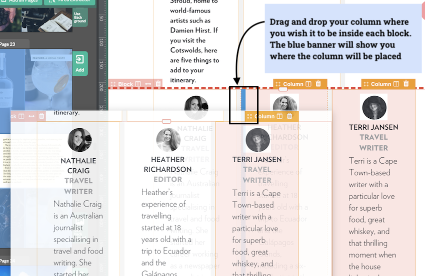
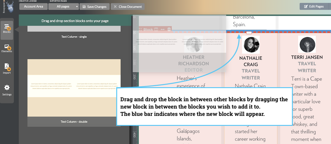
Move a column
To reorder columns, drag the top banner of a column to a new position. A blue marker indicates where the column will be placed.
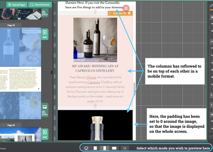
Column display on different devices
To check how columns reflow on different screens, use the device selector at the bottom of the publisher.
In this mode, you can also tune column-specific padding and layout behavior for each device size.