Customizing the online annotations viewer
The document viewer is customizable using some basic CSS and HTML skills. The viewer comes with templates for desktop browsers and touch based devices which are defined in HTML include files. All buttons and input controls can be styled in these files. Buttons can be removed and new buttons added to fit your style.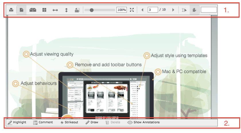
The top toolbar (1) is defined in the file "UI_flowpaper_desktop.html" for desktop based systems and "UI_flowpaper_mobile.html" for touch based devices. The bottom toolbar (2) is defined in the file "UI_flowpaper_annotations.html". Both the flash viewer as well as the HTML5 viewer uses the same template files so changing them will affect all display formats.
The code snippet below shows three of the buttons from the bottom toolbar. All classes used in the toolbars are defined in the flowpaper.css file which is included with all builds.
<div class="flowpaper_bttnHighlight flowpaper_tblabelbutton" style="background-image:url(images/annotations/pencil.png);width:70px;" onclick="$FlowPaper('documentViewer').setCurrentCursor('AnnotationsCursor',event.clientX)">Highlight</div>
<div class="flowpaper_bttnComment flowpaper_tblabelbutton" style="background-image:url(images/annotations/icon_note.png);width:80px;" onclick="$FlowPaper('documentViewer').setCurrentCursor('NoteCursor',event.clientX)">Create Note</div>
<div class="flowpaper_bttnStrikeout flowpaper_tblabelbutton" style="background-image:url(images/annotations/icon_strikeout.png);width:70px;padding-left:23px;" onclick="$FlowPaper('documentViewer').setCurrentCursor('StrikeoutCursor',event.clientX)">Strikeout</div>