Choose the Right Template for Your Online PDF
FlowPaper turns PDFs into interactive documents with links, navigation, and media. Choose between Zine, Elements, and Mobile First based on how much control and flexibility you need.
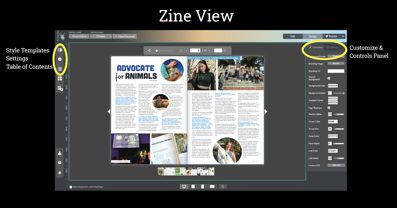
Zine Template
Zine is the fastest and simplest way to publish a PDF as an interactive document. It keeps the original layout while optimizing it for web and mobile viewing. You can add [links](/Add-Links-to-Your-Flipbook/), [images](/Add-Images-to-Your-Flipbook/), [video](/Add-Video-to-Your-Flipbook/), or audio, and present your content as a flipbook with realistic page turns.Use Zine when:
- You want a quick, polished result
- You want to keep your original PDF design
- You are publishing brochures, catalogs, reports, or magazines
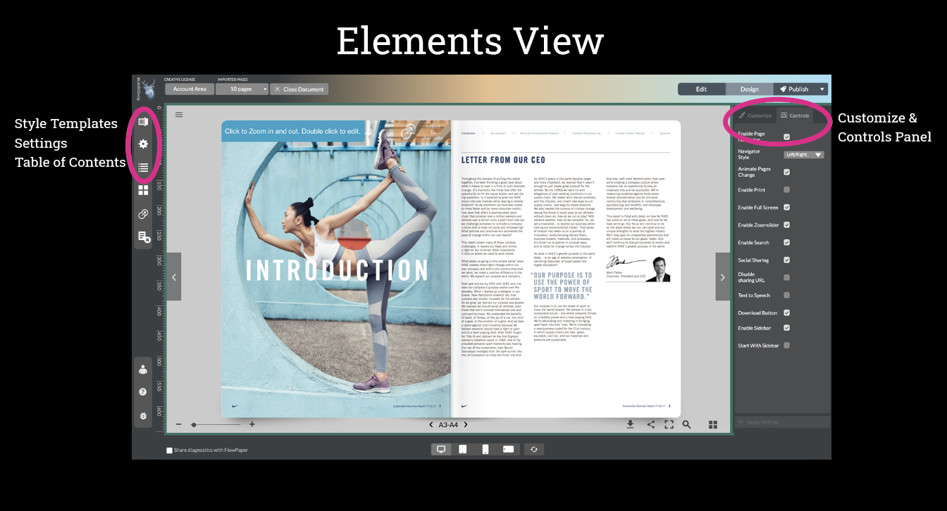
Elements Template
Elements gives you more control by turning your PDF content into individual elements. This allows you to edit, move, and [animate](How-to-make-interactive-brochures-online/) specific parts of your document. You can add interactivity to selected text, restructure content, and improve accessibility with support for screen readers and structured content. It also provides stronger content protection compared to Zine.Use Elements when:
- You need to edit or rearrange content
- You want better accessibility and structured content
- You are creating interactive reports, presentations, or educational materials
Mobile First Template
The Mobile First template lets you rebuild your content into a more flexible, web-style layout. Instead of fixed pages, you can extract sections and arrange them freely. This makes it possible to create layouts that behave more like a website than a traditional document.Use Mobile First when:
- You want to restructure content completely
- You need flexible layouts (e.g. multi-column or modular content)
- You are building landing pages, microsites, or mobile-first content from a PDF